
Looking for brand guidelines examples before you write your own? This guide looks at three real brand guides that anyone can read online, what each one covers, and the parts worth copying.
Brand guidelines (also called a brand book or brand style guide) are the rules for how your brand looks and sounds. They keep your logo, colours, fonts and words the same everywhere, whoever is making the design or writing the post. They usually come near the end of a branding project, because they write down decisions made during the brand identity work.
What brand guidelines usually include
Most brand guides cover the same core parts:
- Logo: the versions you can use, the clear space around it, the smallest size and examples of what not to do.
- Colours: your main and extra colours, with codes for screens (HEX and RGB) and print (CMYK or Pantone).
- Typography: the fonts for headings and body text, with sizes, weights and a fallback.
- Voice and tone: how your brand writes, often with "this, not that" examples.
- Imagery: the style of photos, illustrations and icons.
- Templates: ready-made files, such as a slide, a social post and an email header.
A guide can only explain the logo you have. If yours is hard to read when it is small, fix that first with a logo that works at every size, then write the rules.
The three examples below each lean on a different part, which makes them useful to compare.
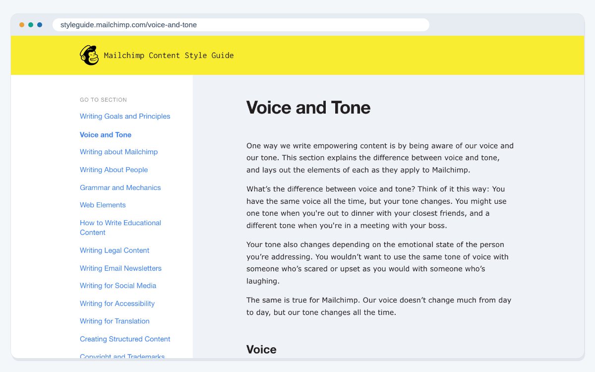
Example 1: Mailchimp's Content Style Guide (voice and tone)
Mailchimp's Content Style Guide was made for Mailchimp employees, to keep their writing clear and consistent across teams and channels. It covers writing goals and principles, voice and tone, grammar and mechanics, and web elements. It also has sections for specific jobs, such as email newsletters, social media, legal content and educational content, plus writing for accessibility, writing for translation and a word list.
What to copy: write your voice rules down with real examples. "Friendly but not silly" means little until you show a sentence that is right and one that is wrong.
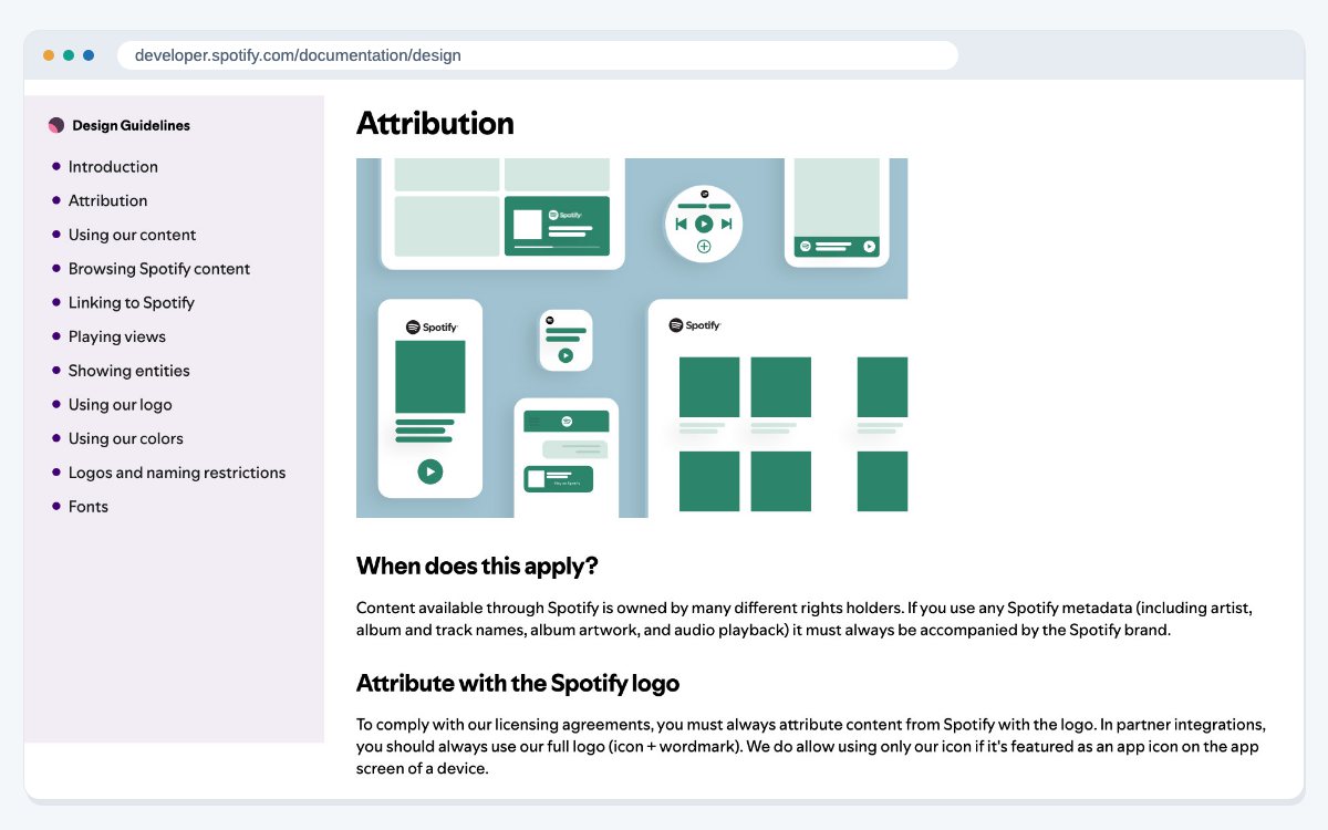
Example 2: Spotify's Design & Branding Guidelines (rules for partners)
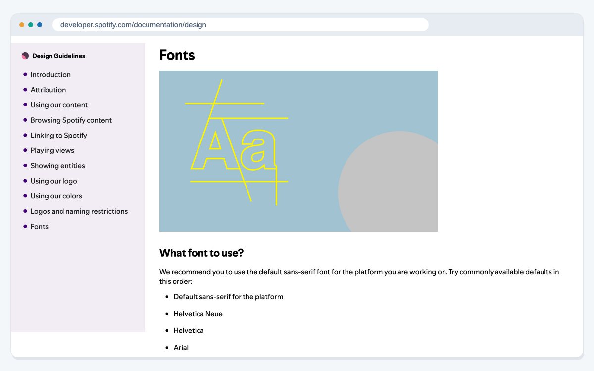
Spotify's Design & Branding Guidelines are written for outside developers who show Spotify content in their own apps. They ask partners to credit Spotify with the full logo, to show album and podcast artwork exactly as Spotify provides it, with no cropping, overlays or blurring, and to link back to the Spotify app.
The rules are short and exact. The full logo must be at least 70 pixels on screen and 20 mm in print, with clear space around it equal to half the height of the Spotify icon.
What to copy: if other people use your brand, such as resellers, partners or the press, give them a short section with only the rules they need.
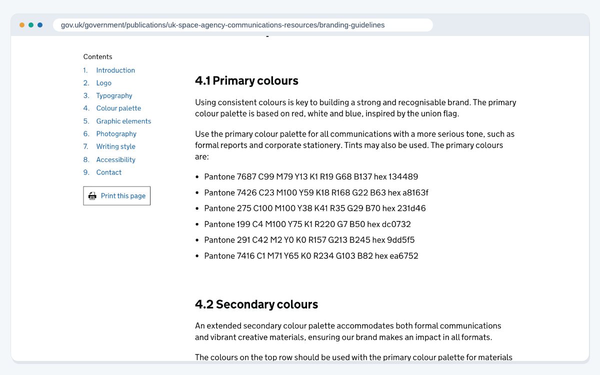
Example 3: UK Space Agency Brand Guidelines (logo, colour and type)
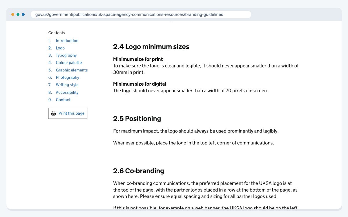
The UK Space Agency's branding guidelines are dated March 2022, and the page that publishes them was updated on 14 March 2023. They set out how to use the logo, including clear space and minimum sizes. They list primary and secondary colour palettes, with Pantone, CMYK, RGB and HEX codes for every colour. They name URW Geometric as the main typeface, with Arial as the fallback when that font isn't available, such as in Microsoft Office.
The guide covers writing too. It asks for plain English and sentences that are usually no longer than 25 words.
What to copy: always give a fallback font. Your team will make slides and documents on computers that don't have your brand font installed.
Logo rules side by side
Spotify and the UK Space Agency solve the same problem in slightly different ways. Both set a smallest size of 70 pixels on screen. In print, Spotify allows 20 mm and the UK Space Agency asks for at least 30 mm. For clear space, Spotify uses half the height of its icon, while the UK Space Agency uses the height of the capital letters in its logo. Both also name the fonts to use when the main one is missing.
The lesson is not to borrow their numbers. It is to give exact numbers of your own, so nobody has to guess. Test your logo at its smallest size on a phone screen before you write the rule down.
What to put in your own brand guidelines
You don't need a 100-page book to start. A short guide that people actually use is better than a long one nobody opens. Start with:
- Your logo files, with clear space, minimum size and three or four "don'ts".
- Your colours, with HEX, RGB and CMYK codes.
- Your fonts, with a fallback for each one.
- Five or six voice rules, each with a right and wrong example.
- A few sample designs: a social post, a slide and an email header.
- One page for partners, if other people use your logo.
If your team builds a lot of slide decks and sales presentations, add a template file so every new deck starts on brand. Your website should follow the same guide, and the colours and fonts should match the visual style you set when you design a website.
Keeping your guide current
Keep one current version in a place everyone can find, such as a shared folder or a simple web page. Put the logo and colour files next to it, so people don't copy old versions from past projects. When something changes, update the guide, note the date and tell the people who use it.
The same habits work when the brand is a person rather than a company. Our personal branding examples show how three well-known people keep one clear topic and one voice for years.
If you would like a designer to turn your logo, colours and voice into a guide your team will use, our brand guidelines design service can help.
Frequently asked questions
At least your logo rules, colours with their codes, fonts with fallbacks, and voice and tone rules with examples. Many guides also cover photos, illustrations and templates.
People often use the words to mean the same thing. Some teams use "style guide" for writing rules, like Mailchimp's, and "brand guidelines" for the full look and feel.
It helps as soon as more than one person makes designs or writes for the business. A few pages covering logo, colours, fonts and voice is enough to start.
Yes. Many are public, such as the Mailchimp, Spotify and UK Space Agency guides above. Use them for ideas, but write rules that fit your own brand.
There is no set length. Start with the few pages people need every week: logo, colours, fonts and voice. Add sections only when people keep asking the same question.
Usually not. Some teams call the designed PDF or printed version a brand book, and the rules inside it brand guidelines. What matters is that everyone uses the same current version.
A PDF is easy to share and print. A simple web page is easier to keep up to date and to link to. Whichever you choose, keep the logo and colour files next to it.
Whenever something changes, such as a new logo version, colour or product name. A yearly check is also a good habit, so the guide still matches how the brand is really used.
One named person or team, often in marketing. They answer questions, approve changes and tell everyone when a new version is ready.
It is the empty area around a logo where nothing else may go. Spotify sets it at half the height of its icon, and the UK Space Agency uses the height of the capital letters in its logo.
Sources
- Mailchimp Content Style Guide
- Spotify for Developers: Design & Branding Guidelines
- UK Space Agency: Branding guidelines (March 2022, page updated 14 March 2023)
Last updated: